|
|
||||||||||||||||||


 01-23-2007, 06:48 AM
|
#41 | |
|
Veteran

Offline Posts: 849
 -->
-->
Join Date: Aug 2006
|
Quote:
I wouldn't worry about them being fragile. Hasbro took over the Marvel Legends line and with their first wave improved on the articulation and durability of the joints big time. Looks like they are implementing some of that articulation design into these figures so you can rest assured they will hold up. Lets face it. Going off this one pic this line of figs is going to be superb. The production photo is usually better then the actual fig but with Hasbro its usually not that big of a diff.
__________________
You have the look of a man who accepts what he sees because he is expecting to wake up. Ironically, that's not far from the truth. |
|

|
Compatible? |
|
01-23-2007, 07:13 AM
|
#42 |
|
Veteran

Offline Posts: 168
-->
Join Date: Mar 2006
|
To me what makes a great figure is:
1. A properly proportioned realistic sculpt 2. Realistic color apps (no purples and oranges) 3. Appropriate accessories Storm Shadow looks great on all those criteria. But I buy figures to use them is dios and photos. I have a hard time justifying buying something I can't or won't use in photos. I'm really doubting that these figures can be used along side the stuff I've already got. I really wish they hadn't decided to drop the o-ring, and the ball heads look stupid in photos. Just look at the head of the Barrage figure in all the Barrage photos on this site and tell it doesn't look stupid. If Hasbro was intending to market these primarily to collectors they would have stuck with the o-ring. The shift means they are trying to market to kids and collectors, which is always dicey. The investment in new construction also signals that Hasbro doesn't want the line to die here. I'm keeping my fingers crossed. |
|
|
|
01-23-2007, 08:31 AM
|
#43 |
|
aka 'Paul WS Anderson' ;)
Offline Posts: 7,751
-->
Join Date: Jul 2005

|
There is this to consider.
IF these don't go to the mass retail stores, expect the MSRPs to be higher. IF these can get into Walmart, Target and TRU (and other B&Ms), there's a better chance of them going with that $25 route. Which would be nice. There's a lot of speculation on the packaging and price point. As well, I LOVED the huge muscled Joes of JvC. Imo, that's what Joe needed to step up in today's toy world. I hope when they release the Roadblock pics, he's a big buff daddy. |
|
|
|
01-23-2007, 08:49 AM
|
#44 | |
|
Veteran
Offline Posts: 3,378
-->
Join Date: Apr 2006
|
Quote:
I try to approach things like I would as a kid, what plays well with something else. When I take photos, I sometimes mix RAH and New sculpts, and sometimes don't. Asthetics I understand. But these are toys, and I haven't played with purely Joes by themselves...since...forever. (not that I play with them now, but on my dresser, the latest Star Wars and Joes tend to hang out together...). I wasn't one of those nitpicky kids, other than peferring 3 3/4". When I think about seperating styles of Joes in the past, my next thought was "why don't I just sell off the new sculpts". And I did sell a couple and now regret it, since I was acting like a RAH purist collector and letting that override the fun aspects of the hobby. |
|
|
|
|
01-23-2007, 09:57 AM
|
#45 |
|
aka 'Paul WS Anderson' ;)
Offline Posts: 7,751
-->
Join Date: Jul 2005
|
HAHAHHAHHAAAAA... See, I sold all my ARAH stuff off on ebay. I didn't want to touch the stuff cuz I'd worry the o-ring would detoriate more. I had guys lying in my APC and the o-rings busted w/o me touching them. I figured, there are collectors out there who want them far more than me. I got the new stuff. It was like a new chance to get into a current day Joe and not be stuck w/ the past. I guess I'm more open to alternative Joe verses than I ever was with TF. I mean, the thought of HotRod and crew were ok, but after the movie, i was totally lost. And any incarnation of TF after that, bleh.
I'm a nu skulpt guy now but when we get the full listing of the 25th, I'm worried about how these will look together. Hmmmmm... |
|
|
|
01-23-2007, 10:01 AM
|
#46 |
|
It's been a great ride!
Offline Posts: 14,302
-->
Join Date: Jun 2005

|
Hmmmmmm...I'm still not convinced. I'd rather see a picture of a proper character rather than base my judgement on a darn ninja figure. I'll wait and see.

__________________
"The future's uncertain and the end is always near." - The Doors "Roadhouse Blues". |
|
|
|
01-23-2007, 10:01 AM
|
#47 |
|
aka 'Paul WS Anderson' ;)
Offline Posts: 7,751
-->
Join Date: Jul 2005
|
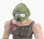
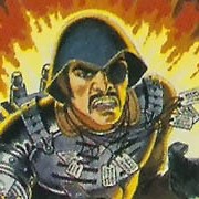
Comparisons.
-image from yojoe.com-  -image from hasbro.com-  |
|
|
25th Duke!!! |
|
01-23-2007, 10:07 AM
|
#48 |
|
aka 'Paul WS Anderson' ;)
Offline Posts: 7,751
-->
Join Date: Jul 2005
|
Duke's the next up for show. Originally shown by Fred over on the JBL this morning, it was later pulled. Now, TNI has it up and well, it ain't going anywhere!
Discuss, yo! -yup, run on over to TNI...- I am Duke! Last edited by Sonneilon : 01-23-2007 at 02:25 PM. |
|
|
|
01-23-2007, 10:19 AM
|
#49 |
|
Veteran
Offline Posts: 3,378
-->
Join Date: Apr 2006
|
Looks kinda stringy. Dunno about him. I was hoping to be blown away by Duke.
Still wondering how these figure will sit, splayed out? Might be hard to use them with vehicles. I mean Sgt. Savage had socket style and those could not sit for sit! |
|
|
|
01-23-2007, 10:47 AM
|
#50 |
|
Veteran
Offline Posts: 3,665
-->
Join Date: Dec 2005
|
Whooohooo! Another Version of Duke, to put with my 40 or so other "Army Buliders" of America's Blond haired, blue eyed Aryan posterboy of rightousness!
I should have figured Hasbro had to have Duke out front! BLAH!!! He's like Jeff Gordon, Oscar De Lahoya, and Dannick Patrick, Poster kids!! |
|
|
 |
«
Previous Thread
|
Next Thread
»
| Thread Tools | |
| Display Modes | |
 Linear Mode

|
|

Powered by: vBulletin Version 3.0.6
Copyright ©2000 - 2026, Jelsoft Enterprises Ltd.
Style Design By: vBStyles.com
Copyright ©2000 - 2026, Jelsoft Enterprises Ltd.
Style Design By: vBStyles.com