|
|
||||||||||||||||||


 03-04-2008, 08:54 PM
|
#11 | |
|
Veteran
Offline Posts: 3,665
 -->
-->
Join Date: Dec 2005


|
Quote:
Excellent point. Being too serious is a danger too. And not addressed very often. Being around Military for the last 20+ years, some of the best Soldiers and Marines I have met, the toughest and the most intense have a sharp sense of humor and laugh and joke in the heat of battle to relieve stress. Making Characters too serious makes them unbelievable, but you have to be careful to make sure not to make them too jocular, also. They need toi be portrayed as serious professionals, but people who can enjoy their work and get loose. GREAT POINT!! |
|

|
|
03-05-2008, 08:55 AM
|
#12 |
|
aka 'Paul WS Anderson' ;)
Offline Posts: 7,751
-->
Join Date: Jul 2005
|
I'm sure there are different ways people do word balloons. Using the CBC not using the CBC. The way I figure it, the process is like this...
1. Have a slight idea of what the script is going to be. Be flexible when changing things up (ie; run out of space in the balloon). When you shoot, consider where the word balloons MIGHT go. 2. With CBC, you gotta resize the shots to a certain size and then let the CBC do the resizing for you. I forgot what the max requirements are for the CBC but I thought it was 900x1100 or something. However, if you go the route that General Hawk and Violent Fix and myself go, we say screw the CBC and we do it on the art program of our choice. Therefore, our shots can be different sizes and the word balloons can be changed easier. 2a. If you use the regular old art programs, RESIZE the shot first THEN put the balloons in. I think some people work with a large canvas, put the baloons and text in and then resize the shot. And then they sit there and wonder why the text got so small. Most likely, the shot was changed, but the VIEW was whatever was appropriate for the monitor. So if you are working with a 1200x1600 palette, the program will make it so you can see the whole shot at once. You put the word balloons and text in and then change the size of the shot, it don't work. I ended up with a LOT of itty, bitty text my first dio. 3. If you run out of place for your text, use the larger CBC windows (I did that a lot) OR shoot more and do more dialogue (that's a 2-edged sword) OR get to the point faster (lol). I tend to be wordy but that's USUALLY because I have so much space! And just a tip for people in the shooting phase: Have music going, be it walkman or mp3 player or whatever. It often helps ya get in the mood and you might have new ideas pop up. And the tip for people working the dios on the computer: Have music going. Again, it'll put your head in the right place. If you are listening to bubblegum pop music, we'll most likely see a LOT MORE NEON characters involved. But if you're listening to metal, I'm guessing there'll be a lot of bodies hitting the floor.  You guys can probably figure out what I was listening to when doing my stuff based on the dialogue. You guys can probably figure out what I was listening to when doing my stuff based on the dialogue. |
|
|
|
03-05-2008, 09:12 AM
|
#13 | |
|
G.I. Smurf

Offline Posts: 3,446
-->
Join Date: Jan 2006
|
Quote:
after you pointed this out i saw how much i did this. i also know why this happened and how to not let it happen again. for me i would have the pic finished, then realize that i could put more focus on a characters actions if i took some of the unneeded background out. this made everything appear closer, thus the words were larger. and i am not bashing anyones work. i have read tons of dios that i love and i know i have miles to go before im a violentfix or hawk, or the guy at tims corner. even if i were great, bashing someone will most often not be helpful to make them better, instead them may just think it not worth their time if no one has anything good to say about their work. just offer little helpful hints. |
|
|
|
|
03-07-2008, 05:28 AM
|
#14 |
|
Veteran

Offline Posts: 344
-->
Join Date: Feb 2005
|
I'm also guilty of the Font size thing that was mentioned here but I never really think someone's reading it and getting upset by it. Example, a close of pic of one character who says a short sentence. If my font stays at 15pt then the word bubble and words the character are saying look REALLY wimpy and strange. So I enlarge them.
The only other time is when there's a long speech. There are only so many shots you can fit in a Dio before it really starts to feel way too long and sometimes you need to get a lot of information across in a certain amount of pics. This never bothered me in reading Dios but maybe that's because I make them and I'm impartial to it. I hope people aren't urked every time I change my font. As for what I don't like about Dios. I can only really think of one thing that truly bothers me and it's something I used to do as well but only because I couldn't figure out a way to get the idea across without doing it. It's when a Dio uses drawn lines to represent bullets flying. Lately I've been using bullet ricochet to get the same point across. Hope it's working, it looks good to me. |
|
|

|
03-07-2008, 09:50 AM
|
#15 |
|
aka 'Paul WS Anderson' ;)
Offline Posts: 7,751
-->
Join Date: Jul 2005
|
I had a 50+ page dio... And that was thru the CBC so you KNOW there were a million shots!
|
|
|
|
03-07-2008, 12:25 PM
|
#16 | |
|
Resolute fanboi

Offline Posts: 4,184
-->
Join Date: Jan 2008
|
Quote:
Wow, I got kudos again   I am in the midst of making preparations for a dio - and all this has been a good read, what to try to do and what to avoid. Truth be told I have avoided reading any dios thus far, because I'd like to have my own go at it before getting my mind set on someone else's idea (I'm very wierd, most have probably noticed ) I have glanced over a few just because I liked the puretty pictures  My first dio is going to be done using normal photography some light photoshopping and whatnot - second and probably shorter one will be using photoshop to make it more "cartoony", I am not sure how well this will go over with the community, but it might be fun to do something totally different. I hope more of you guys add Hates and Loves here so that I can go over my "script" and see if I am doing something terribly wrong. After this discussion here has gone for a while, someone should post a "how-to" on making dios! I think that would be appreciated by the majority. call it a "do's" and "don'ts" list
__________________
Arguing on the internet is like competing in the special Olympics - You may win, but you are still retarded |
|
|
|
|
03-07-2008, 12:35 PM
|
#17 | |
|
Hell hath no fury....

Offline Posts: 7,646
-->
Join Date: Dec 2006
|
Quote:
This is another 'WIP' that I'm in the middle of..........
__________________
Non illigitamus carborundum~Vos mos non effrego mihi 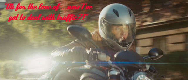 Coming soon: 'JoeSpecialOps' |
|
|
|
|
03-07-2008, 02:02 PM
|
#18 | ||
|
Veteran
Offline Posts: 3,665
-->
Join Date: Dec 2005
|
Quote:
One thing I do is pick a few members here that I trust their judgement and "leak" the story before it's 100% finished. Quote:
I did this at one time, but it was more geared towards the photography in the dios and not so much the storyline/content. Maybe I can get off my keister and write something about this.....hmmmmm here is the one I did on the photo's side of the house; http://www.joedios.com/forums/showthread.php?t=447 |
||
|
|
|
03-07-2008, 05:50 PM
|
#19 | |
|
G.I. Smurf
Offline Posts: 3,446
-->
Join Date: Jan 2006
|
Quote:
like i said, i do the font thing. it doesnt bother me at all, but i guess it does some, so im going to try and keep an eye on this in the future. me, im to inot the story and whatnot to even notice. the bullet thing, i do this, and i do it badly. i have been known to put in a lot of flying bullets and making them to thick at first. then i tried making the lines break, like one long shot repeating. now i make the line smaller, and i am also thinking of making them white and more see through. |
|
|
|
|
03-08-2008, 04:19 AM
|
#20 | |
|
Veteran
Offline Posts: 344
-->
Join Date: Feb 2005
|
Quote:
Would you like me to send you a PSD file of my bullet ricochet? You might like using them, like in the pic below. 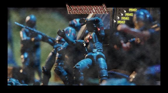 |
|
|
|
 |
«
Previous Thread
|
Next Thread
»
| Thread Tools | |
| Display Modes | |
 Linear Mode

|
|

Powered by: vBulletin Version 3.0.6
Copyright ©2000 - 2026, Jelsoft Enterprises Ltd.
Style Design By: vBStyles.com
Copyright ©2000 - 2026, Jelsoft Enterprises Ltd.
Style Design By: vBStyles.com