
 |
Np i just thought these where neat pieces.
|
Cant' wait to see the finished product. Are you going to paint the cardboard, leave it as is or layer it with something?
|
Quote:
I'm going to go with manufactured wood slats from Michaels and paint them, I believe. Probably a deep brown, as this is in a forest setting, or possibly a dark and weathered grey color, with patches of green and brown, from the wear and tear of the surrounding environment. Any suggestions, oh great one? |
*sigh*
Ok, I've made some progress today. My fingers are blistering and my back and arms hurt (cuz I'm, apparently, some kind of sissy-boy), but I present more of my Comm. Station...a work in progress... I'm semi-pleased with it, as it's coming along. I've made some mistakes, learned quite a bit, but I think, in the end, I'll be happy with it. And that's pretty much why I started it. Here, you can see that I've seperated the walls and began cutting up the wood-slats. I hotglued them to the cardboard and it holds quite well, very solid. Gotta be quick, though...as the hot glue cools fast, so apply the wood to the cardboard quickly and carefully! Also, I did the window/door frames. The miter saw was a handy little tool to have for this! 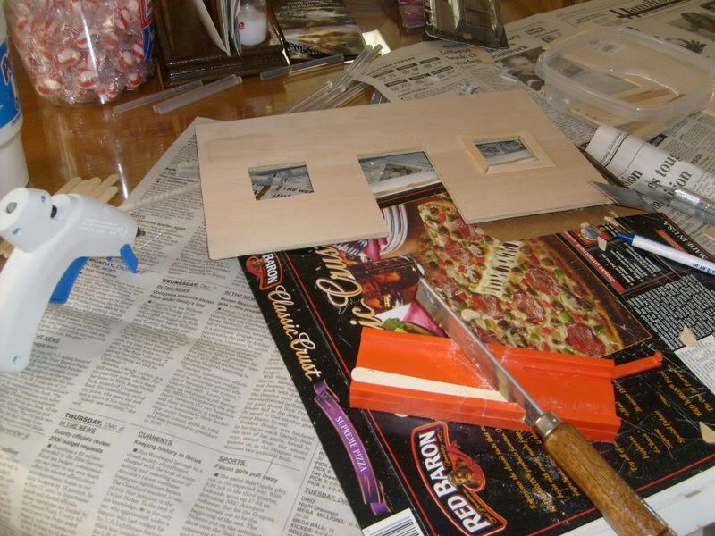 One side down... I've stained the wood, and I like the dark color. It helps to hide the mistakes/imperfections a little better, plus, I think for a foresty-type of setting, it'll look nice. Check out the window on the right. Yeah, definitely didn't measure twice before cutting once. 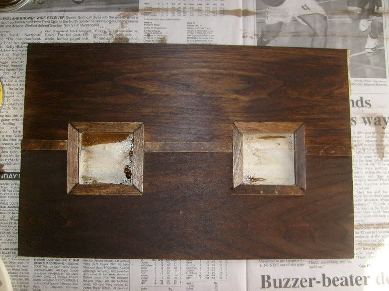 I improved my window framing as the day wore on... 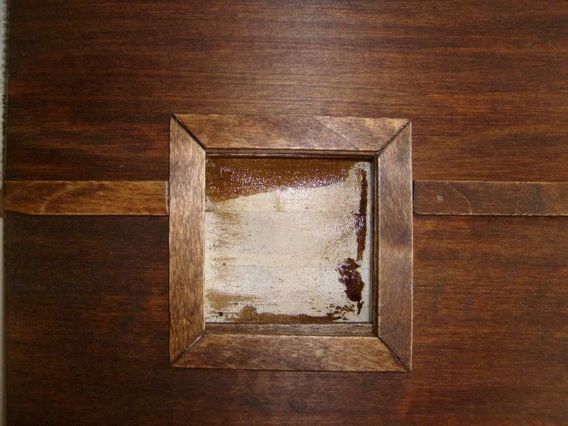 Hmm, it's starting to actually look a bit more professional...a bit more like a building...a bit more like a GIJoe Communications Station!! 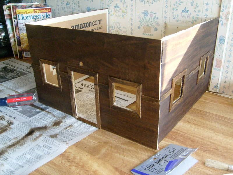 Now this is something I'm especially proud of. These really awesome lights with a super-bendable/adjustable neck are available at WalMart for less than $3. Well, I carefully poked a hole through the wall, and carved it out, gently, and pushed the head through, shaping the neck as I needed. I attached the body of the flashlight to the wall behind (temporarily). I'm going to make an awning to cover up the light. 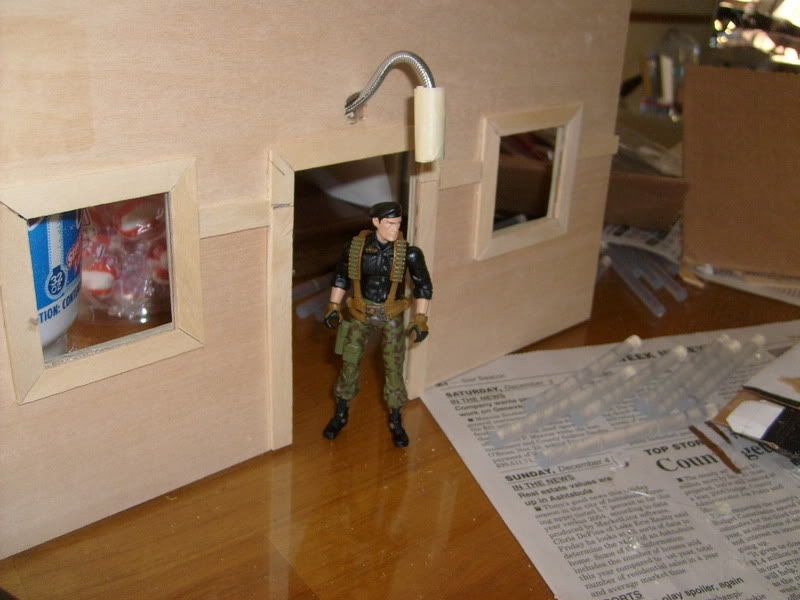 Flint, at night, coming out of the Comm. Station...the light barely illuminating the path in front of him. Something doesn't feel right here...  These pics were taken in a completely dark room, no flash. The only light provided was from the flashlight. I like it a lot. I bought 8, haha. 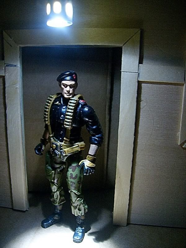 So, that's where I'm at at 5pm on Saturday. I haven't slept in almost 24 hours and boy am I feeling it!! Plus, I haven't eaten since 2am at work...all I had was a Toaster-Struedel at 10am. So, be kind, but how do you guys think it's shaping up? |
Pow!
You're shaping up sexy and fruity delicous...
Dude, this is seriously nice. I love the wood stain, it's gonna look sick in a forest setting. The light is a cool idea, and with an awning covering it, it's gonna be super-functional. Door frame and window frames look good, I like that you broke up the building with the molding half-way up. This is turning out very cool. I will however warn that your constant whining in that last post to be a sign of weakness. Don't give into the evil - suck it up and press on. The rest of us here on joedios don't care if your fingers are bleeding and you haven't slept... Just ask yourself, what would Flint do if he was on the job? Schweet job Skot - it's time for some old-school ACDC - that'll keep you going. Cheers! ~ Paul. |
Quote:
Ha! What's really funny is that the entire time I've been working on it, I've had Metallica playing, haha. Thanks, I appreciate the sentiments. The molding half-way up is actually covering the seam where the two slats meet, so it's form and function. After I'm nearing the end, I'd like to have some type of vine going up the sides in spots. So, next, I tackle the back wall, with removable section, and then the roof. The roof will be interesting... I think that it might come out very well and be my favorite part. We'll see. Thanks again! |
wow terrific. The light it a really awesome idea and look just right with the figs and what your doing with the wall is interesting can't wait to see more.
|
Quote:
Nothing at all, I think your doing a great job. I can't wait to see it finished. |
Quote:
Thanks VFX, that means a lot, coming from you. I've done quite a bit of work on the roof. I'll post pics of that later today. |
Ok, small update:
I added some thickness to the roof. Good ol' cardboard! Then, I took some wooden dowels and created a ledge. It has a sort of step built in to it. 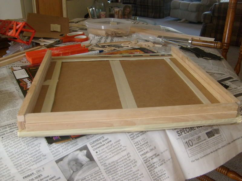 Here, I've sprayed it wih "Stone Touch" spraypaint I found at Michaels. "The look and feel of Stone". I gotta say, it's great! I'm impressed. It truly does feel like concrete! The color is a little lighter than I thought it would be, but I'm going to darken it up a bit, possibly with a black wash. 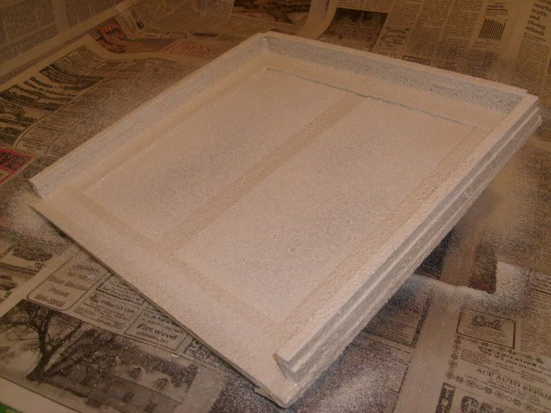 Well, I temporarily propped it all up and together to see what I'm looking at so far. I have to say, I'm almost liking it!! :) It doesn't look too bad. It's still a good ways from complete, but it really makes me happy seeing it come this far. 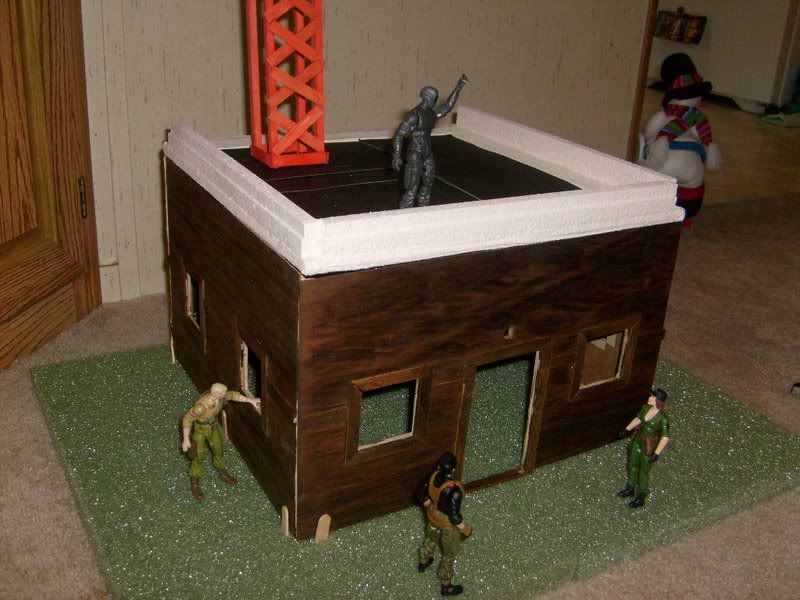 I added a super fine grit sandpaper to the roof to give it that tar-paper look. It feels just like a roof like that would! It's not rough to the touch at all, either, and I'm probably going to weather it a bit, making scuff marks and indents where water would've settled. The tower, well, I wasn't that happy with it, and I'm still not, but I do like that it'll be there. 5thC suggested a darker color for it, like a green, and I'm leaning that way. I also might scrap what I have there and start from scratch with a different design. We'll see. The back ledge was left off because I am building in a ladder from the ground, attached to the back of the building, so I need an opening for it. Gotta have roof access!! Snake Eyes is impressed...so am I! 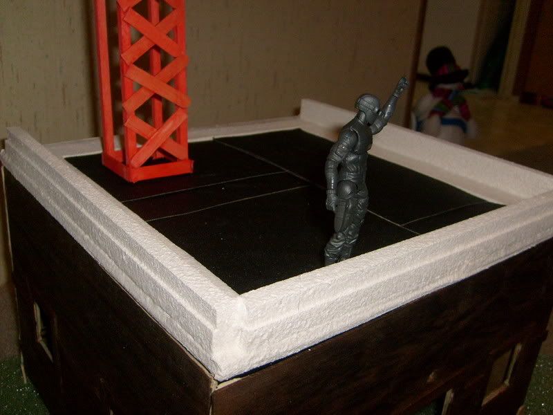 Just another (blurrier, sorry) view. 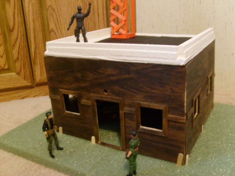 So, that's where I'm at. I'm going to tackle the interior walls and floor before attached it all together. Alright, homeys, what say ye?! |
| All times are GMT -7. The time now is 04:56 PM. |
Powered by: vBulletin Version 3.0.6
Copyright ©2000 - 2024, Jelsoft Enterprises Ltd.